
A Minimum Wage Natural Experiment Has Been Running for Over a Decade
When 30 States Raised Minimum Wages, What Happened to Pay and Jobs?

The federal minimum wage of $7.25 has not been raised since …. wait for it … 2009. That’s 17 years, if you’re counting. At the same time, after 2013, 30 states have raised their minimum wage above the federal floor. The other 20 have stuck with $7.25 an hour throughout. More than a dozen years later, this divergence has become an unprecedented “natural experiment” in minimum-wage policy — not just in the United States, but anywhere. Teasing out causality in social sciences is hard. But this large, persistent, and still-widening gap between the two groups gives us an unusually informative “laboratory” for testing predictions about the labor-market effects of minimum-wage policy.
Let’s have a look.
Two halves of the country, one big difference
The map below shows the 30 raise states in green, shaded darker for a higher 2025 minimum wage, and the 20 federal-floor states (still at $7.25) in gray.
Figure 1. The 30 raise states (green, shaded by 2025 minimum wage) vs. the 20 federal-floor states (gray)
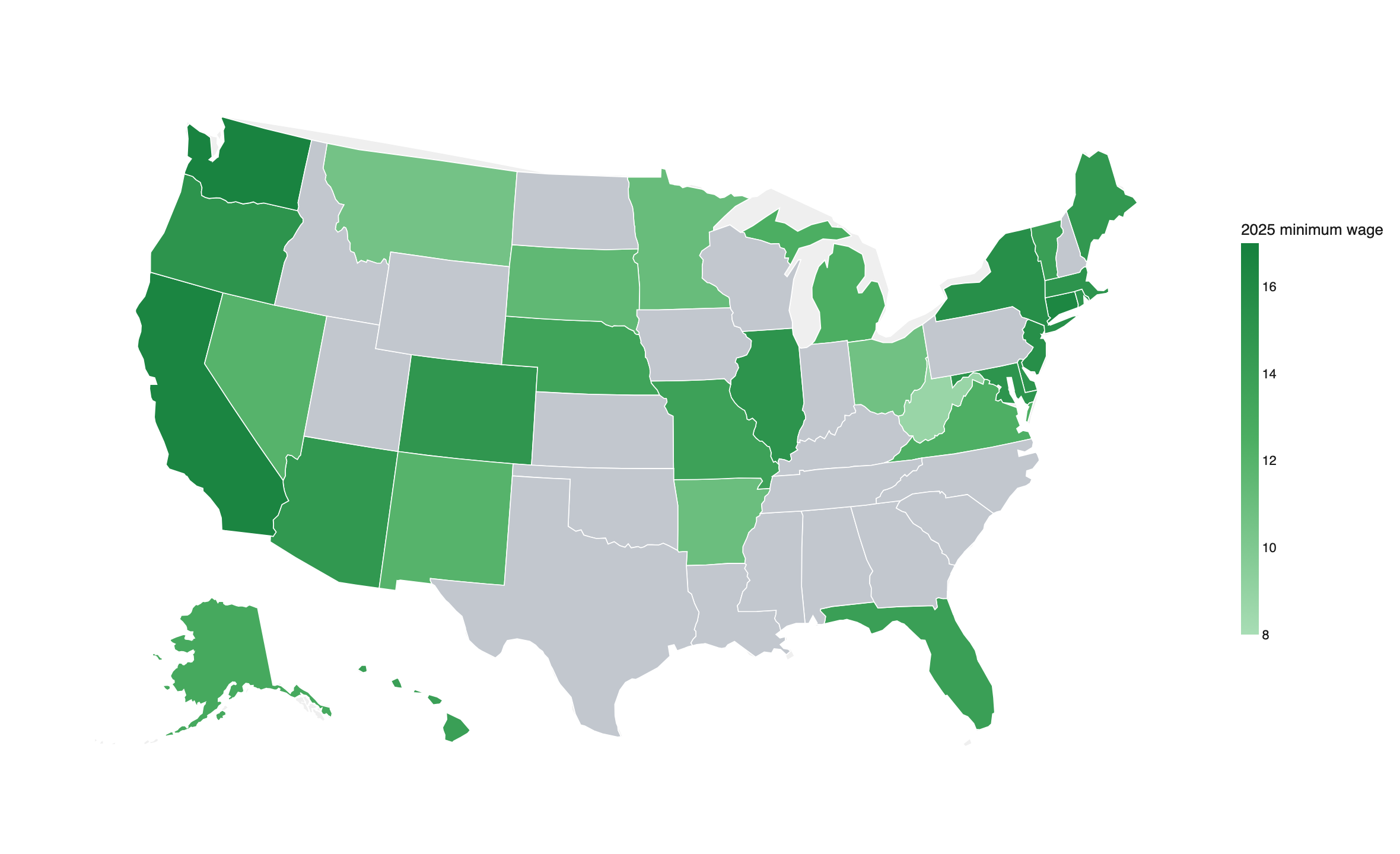
Notes: Raise states raised their minimum wage above the federal floor at some point since 2013; federal-floor states stayed at $7.25 throughout 2013–2025. Source: state minimum-wage statutes.
Fig. 2 shows that the gap between the two groups has widened steadily since 2013. In the 30 “raise states,” the average floor climbed from $7.60 in 2010 to $14.44 by 2025. The light green band shows the spread between the lowest and the highest of these floors by year, ranging from $8.75 in West Virginia to $16.66 in Washington in 2025. For the 20 “federal-floor” states, in contrast, the nominal minimum wage remained stagnant at $7.25 throughout the whole period.
Figure 2. Minimum-wage levels, 2010–2025: raise states vs. the federal floor
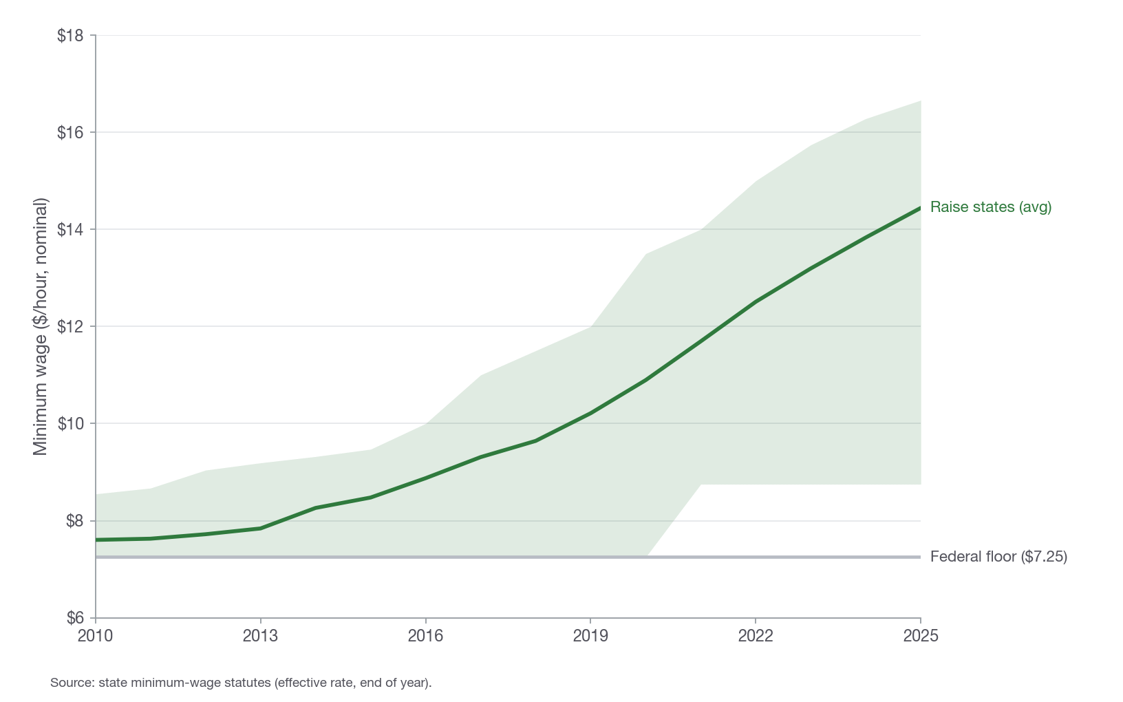
Notes: Green line: population-weighted average minimum wage across the 30 raise states; band: full range, from the lowest to the highest state floor. Gray: $7.25 federal floor. Nominal dollars. Source: state minimum-wage statutes.
Did paychecks go up? Did jobs disappear?
A natural place to start is the industry most affected by the minimum wage: restaurants and other eating places (NAICS 7225). This low-wage industry is the most heavily studied by economists. The BLS Quarterly Census of Employment and Wages (QCEW) covers nearly every private-sector employer, so we can track the two groups of states year by year. For each year, the QCEW data reports the average weekly earnings and the average headcount employment over a pay period by industry and state (or county).
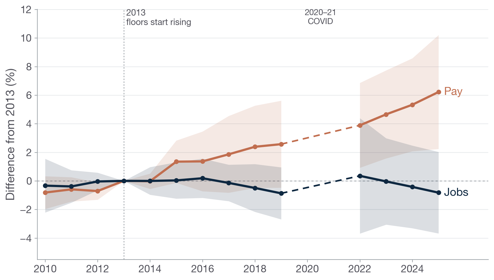
Figure 3 plots the year-by-year gap in restaurant pay and jobs between the raise states and the federal-floor states. The figure indexes everything to 2013, the year before floors started rising: this is the base period. Then it shows the gap in the percentage change in the outcomes (i.e., average restaurant earnings in red, per-capita restaurant employment in blue) from 2013 to another year, like 2019, or 2025. The dots and lines show the actual estimates. The shaded area shows the margin of error (95% confidence interval).
What do the data show? First, average restaurant pay diverges steadily from 2014 onward: averaging over 2023-2025, the average wage grew by around 7.7% ( ±3.3%) more in the raise states since 2013. Restaurant employment, by contrast, tracks close to the 2013 baseline throughout, changing by 0.3% ( ±3.3%) over the same period. Dividing the employment change by the wage change gives an “own-wage elasticity” (OWE) near zero, of +0.03. (A quick refresher: an OWE of something like -1 would be a “big negative,” with job losses erasing all wage gains; while something like -0.1 suggests very limited job losses. For more on the OWE see my post here.)
Figure 3. Year-by-year restaurant pay and jobs gap: raise states minus federal-floor states
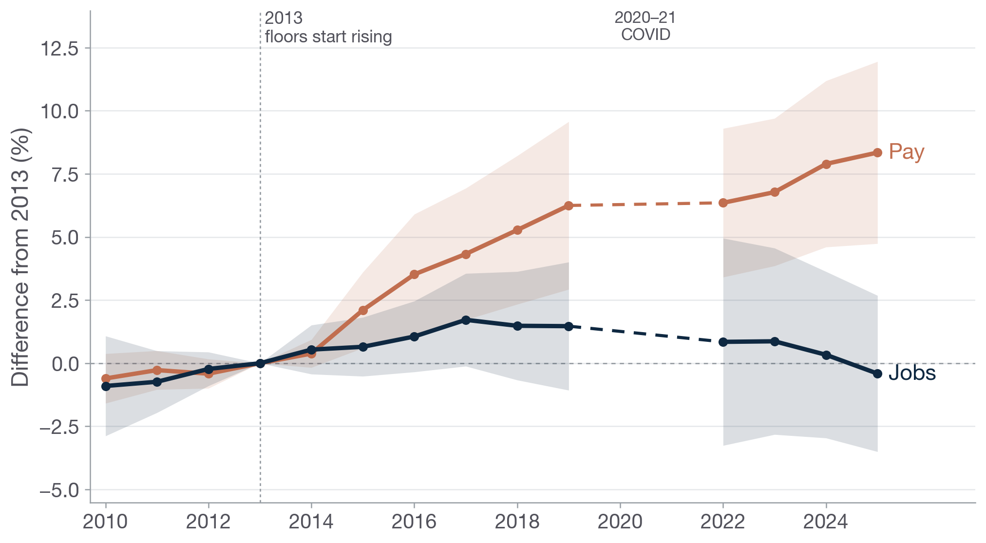
Notes: Each year’s point is the percent gap in restaurant (NAICS 7225) average weekly wage or jobs per resident between the raise states and the federal-floor states, relative to 2013. State and year fixed effects; each state weighted by 2013 population; shaded bands are 95% confidence intervals clustered by state. COVID years 2020–21 are set aside (dashed bridge). Source: BLS QCEW.
Checked three different ways — and they all agree
The comparison above was the simplest one to make, and also the most transparent. We just plotted the gap in the average per-capita restaurant employment and earnings growth between the two groups of states starting from 2013. But we can also do fancier analyses that have been used by economists studying minimum wages (or similar policies).
2010 paperrecent updateFirst, we can compare adjacent counties on the opposite sides of a state border where one side is a “raise” state while the other side is a “federal-floor” state. This type of analysis holds constant a lot of confounders like regional shocks, giving a more apples-to-apples comparison (for more along this line of analysis, see my 2010 paper and a more recent update). Finally, a third approach compares the 30 raise states to a “twin” (or synthetic control) constructed from reweighting the 20 federal-floor states to match the trajectories in outcomes before minimum wage hikes started in 2014. (See here, and here, for more on this synthetic difference-in-difference approach.)
All three approaches show clear gains in average restaurant pay: as already discussed, comparing the 2023-2025 average to 2013, the baseline comparison shows +7.7% change in pay, coupled with a +0.3% change in jobs. Comparing neighboring counties across state lines, we find a pay increase of +4.2% ( ±1.7), and a change in jobs of −0.5% ( ±3.2). Finally, the synthetic “twin” states suggest a pay hike of +7.2%, coupled with a −0.6% change in jobs. Each of these research designs shows a clear, statistically significant pay bump, and a small change in employment indistinguishable from zero.
Figure 4. Restaurant pay and jobs gap under three research designs (pooled 2023–2025 vs. 2013)
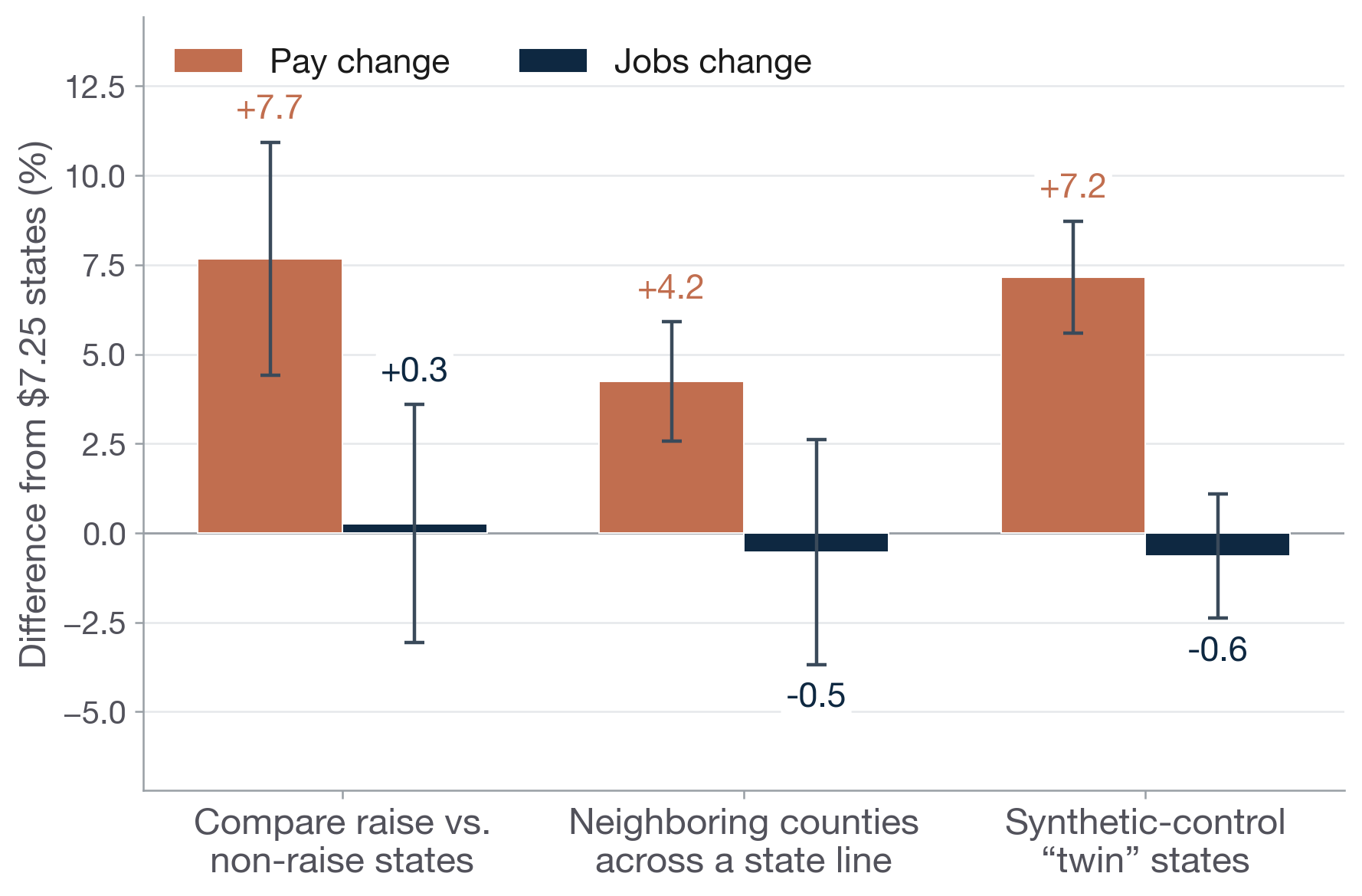
Notes: Each pair of bars pools 2023–2025 relative to 2013 under a different design. Whiskers are 95% confidence intervals clustered by state. Source: BLS QCEW.
Does the size of the raise matter?
What happens when we look within the raise states and focus on those that raised wages the most? We can consider two different ways of measuring the size of the raise: the first method considers the level of the 2025 minimum wage, while the second method considers the 2025 minimum wage as a share of the state’s typical (median) wage — its “bite.” (When the median wage is lower, it indicates that the same floor might reach further up the local pay ladder.)
As Figure 5 shows, for both measures the pattern is clear: bigger minimum wage boosts meant bigger pay gains for restaurant workers. In neither case does the group with the largest raises show any indication of a more negative employment effect — in fact those groups’ employment estimates are slightly positive, though not statistically distinguishable from zero.
Figure 5. Restaurant pay and jobs gap by size of the raise (pooled 2023–2025 vs. 2013)
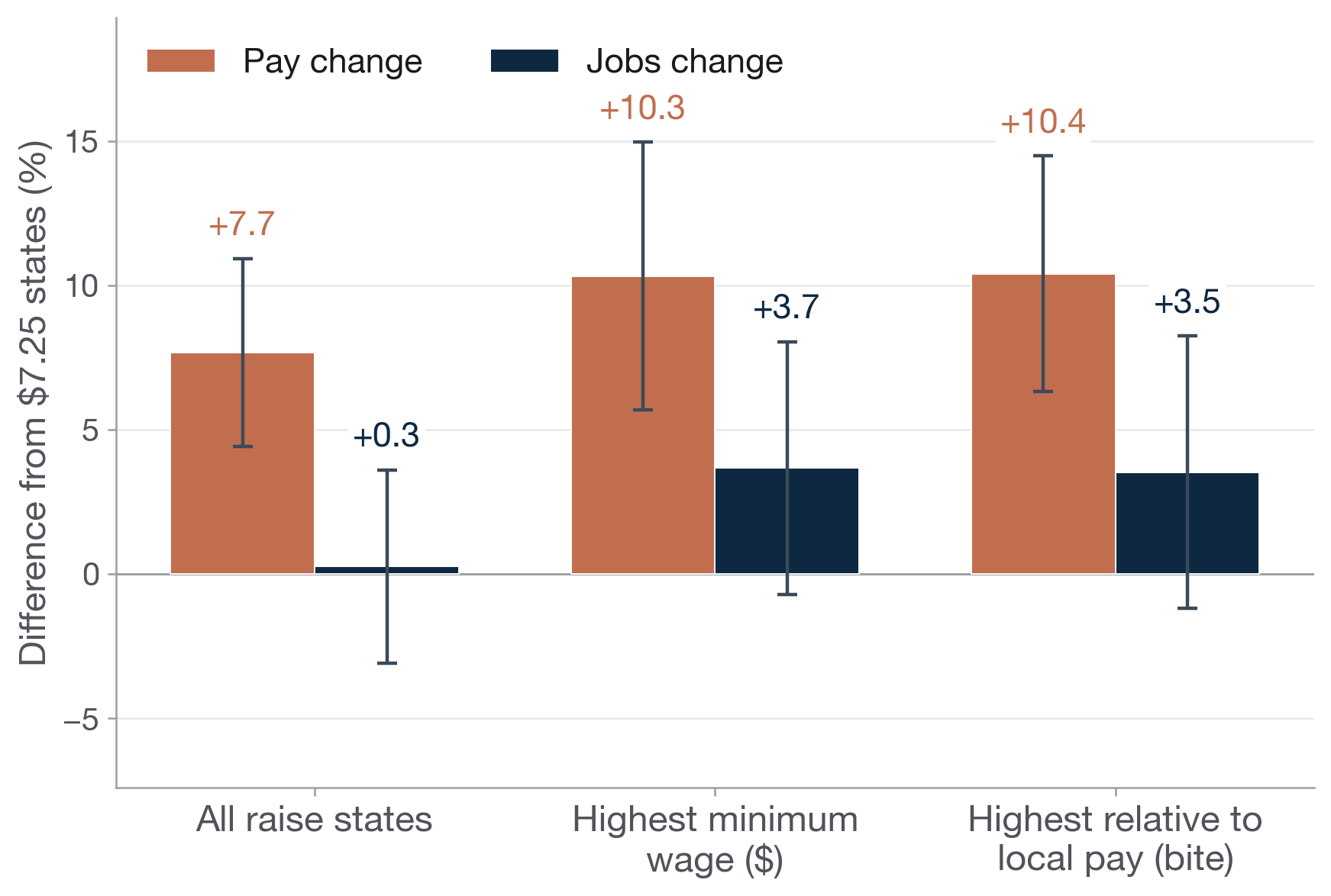
Notes: All raise states vs. the third with the highest 2025 minimum-wage level and the third where the floor reaches highest relative to local pay (bite). Each state weighted by 2013 population; 95% CIs clustered by state. State median wages from EPI. Source: BLS QCEW.
Restaurants and beyond: all low-paid industries
We can broaden the lens beyond restaurants. The “all low-paid industries” aggregate adds accommodation and food services, retail trade, other services, arts and entertainment, and administrative and waste services: these comprise the bulk of low-wage employment outside agriculture.
Figure 6 shows that pay rose in both groups. The effect is larger in restaurants, where the floor bites hardest. However, when it comes to jobs, employment change was +0.3% in restaurants and −0.1% in low-paid industries, neither statistically different from zero.
Figure 6. Restaurants vs. all low-paid industries, all raise states (pooled 2023–2025 vs. 2013)
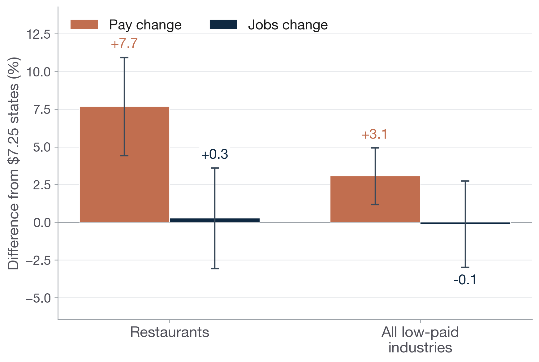
Notes: Restaurants (NAICS 7225) vs. a broader low-wage aggregate (NAICS 72+44–45+81+71+56). Population-weighted; 95% CIs clustered by state. Source: BLS QCEW.
Extending the analysis to all low-paid industries, while considering states with the highest minimum-wage level only, we see an average pay increase of +2.6% ( ±1.7), while jobs change is +2.6% ( ±4.1); again, no sign that the higher floor led to lower jobs.
Figure 7. Restaurants vs. all low-paid industries, highest-minimum-wage states (pooled 2023–2025 vs. 2013)
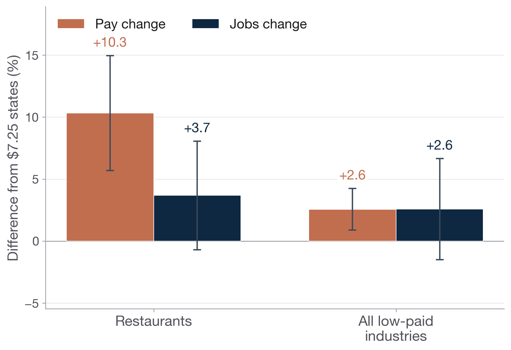
Notes: Same comparison as Figure 6, restricted to the highest-minimum-wage states. Source: BLS QCEW.
Many red and purple states raised their minimum wages
While the 30 raise states lean Democratic, there are plenty of examples of Republican-leaning red and purple states that raised their floors. 12 states raised the floor and voted for Donald Trump in 2024. This is of interest for at least two reasons. First, the 20 federal-floor states lean right, so these 12 states share more similarities, making perhaps a more apples-to-apples comparison. Second, as voters in some of these 20 states consider raising their minimums—like on June 16 in Oklahoma, where I was earlier this week, talking about The Wage Standard—the impacts in these 12 states may be more relevant when thinking about likely consequences.
Figure 8. The 12 red/purple states that raised their minimum wage
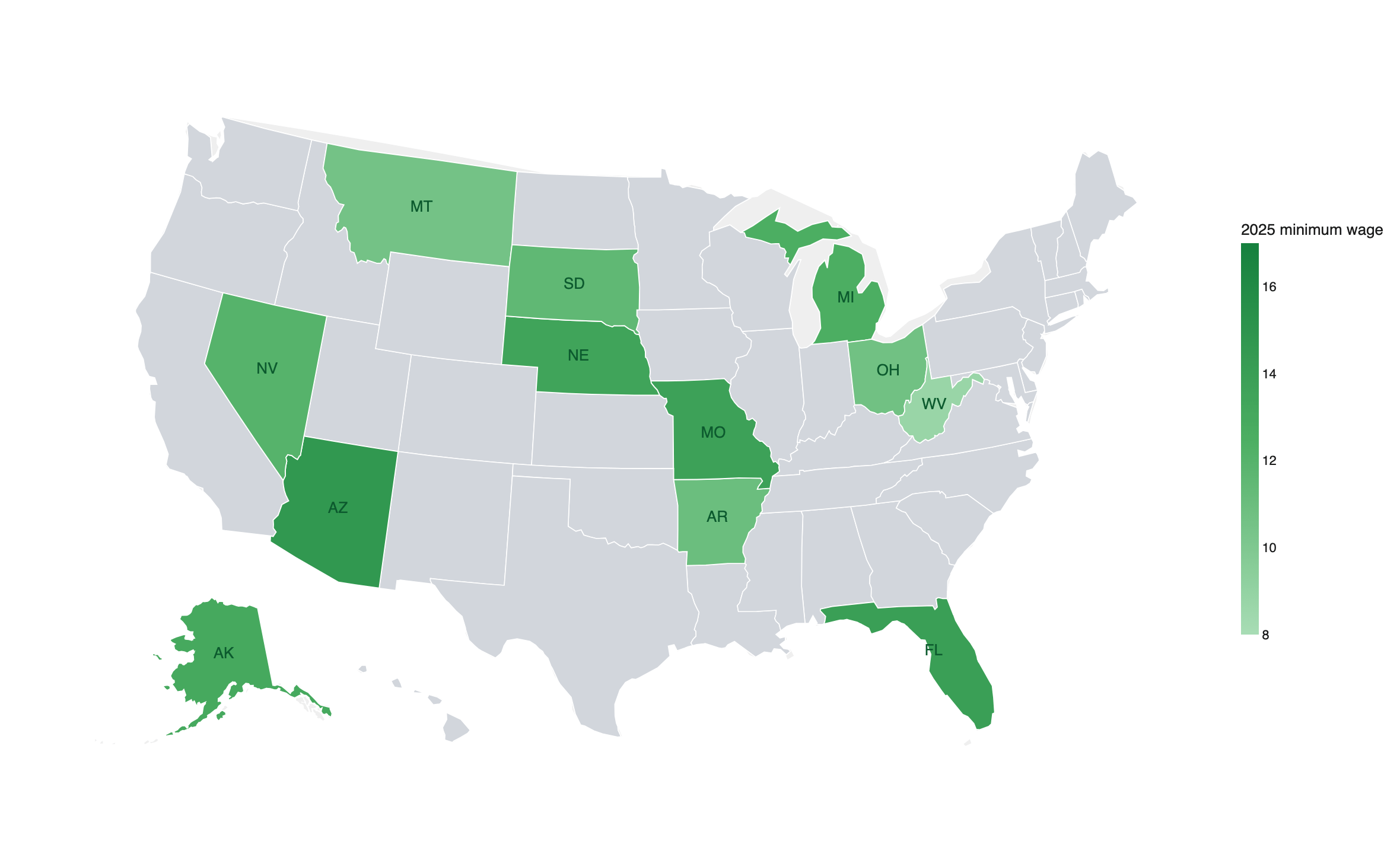
Notes: States that raised the minimum wage and voted Trump in 2024 (green); others gray. The five heading toward ~$15 by ballot: AZ, FL, MO, NE, AK. Source: state statutes; 2024 election returns.
Figure 9 shows the pay and employment path of these 12 red/purple raise states compared to the 20 federal-floor states. Again, there is a clear boost in restaurant pay to the tune of +6.2% by 2025. And again, restaurant jobs gap remains flat (−0.8%, ±2.9). Overall, we see a similar story in these red/purple states as in the broader set of raise states.
Figure 9. Year-by-year restaurant pay and jobs gap: 12 red/purple raise states minus federal-floor states
Notes: Percent gap relative to 2013 across the 12 red/purple raise states. COVID years 2020–21 bridged (dashed). 95% CIs clustered by state. Source: BLS QCEW.
Further considering the 5 red/purple states that all have a path to $15/hour by 2026, we find a little larger pay boost at +7.5% ( ±2.5), while the effect on jobs is +0.1% ( ±3.2). The story remains the same even as we consider these stronger minimum wage hikes in red/purple states that all passed their minimums using ballot initiative (just like voters in Oklahoma).
Figure 10. Pooled restaurant pay and jobs gap: all 12 red/purple raise states and the 5 ballot states
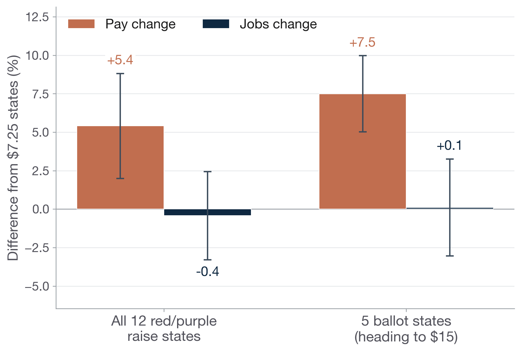
Notes: Pooled 2023–2025 vs. 2013. The 5 ballot states are heading to ~$15. 95% CIs clustered by state. Source: BLS QCEW.
If it’s not jobs, how are minimum wages absorbed? The 3 P’s
Stepping back, the standard model of supply and demand tells us that a government mandated floor will lead to lower employment. Why does that not happen here? As I explain in The Wage Standard, in real life, employers hold wage-setting (monopsony) power; and they may opt to pay a lower wage even though it might lead to higher vacancies and quits because it is more profitable. In such a world, a higher floor pushes up pay and can cut vacancies and quits—not jobs—at least up to a point.
So in a world where jobs don’t fall, how are the added costs absorbed? Here it’s useful to think about the “Three P’s” that summarize the absorption channels:
Productivity: Minimum wages can lead to higher productivity through a variety of channels. This includes reduced turnover, which saves costs of recruitment and retraining. It also can lead to more incentivized workers. And finally, there may be some reallocation towards higher productivity companies in the market.
Profits: Some of the cost is absorbed via lower profits, although here the evidence is somewhat more mixed.
Prices: Finally, some passed through to prices. This is an important mechanism that helps soften the blow for companies’ bottom lines. And it might mean somewhat higher costs for some low-wage-intensive goods and services. But the scale is quite small and limited. For instance, a $5 burger might cost 15¢ more; but overall price levels (as measured by, say, the consumer price index) barely move.
(For more on this, see here.)
Take-away
Since 2013, 30 states have raised their minimum wage substantially — the population-weighted average nearly doubled. Compared to the 20 federal-floor states, restaurant pay rose about 8 percent more, while restaurant employment grew at essentially the same rate. The same story emerges across the broader set of low-paid industries, across three independent research designs, across the biggest raises, and across red and purple states alike. This doesn’t settle all questions about the policy’s impact on employment — for example, on specific groups of workers — and the data also cannot assess effects on hours of work. But within the range of policies actually attempted in the US between 2013 and 2025, wage floors appear to have delivered wage gains at the bottom without a noticeable impact on jobs in the key low-wage sectors the policy targets.
Nice one, Arin! Love your work.
The turnover point in the Productivity bucket matches what the math looks like from the floor. Recruitment and retraining are real line-item costs, and they're easy to under-count because they hide inside "normal" churn. When pay moves people out of constant-quit mode, a chunk of that "cost" was never as fixed as the model assumes. Useful to see it isolated in the data.